Overview
A designer’s sketchbook, made public.
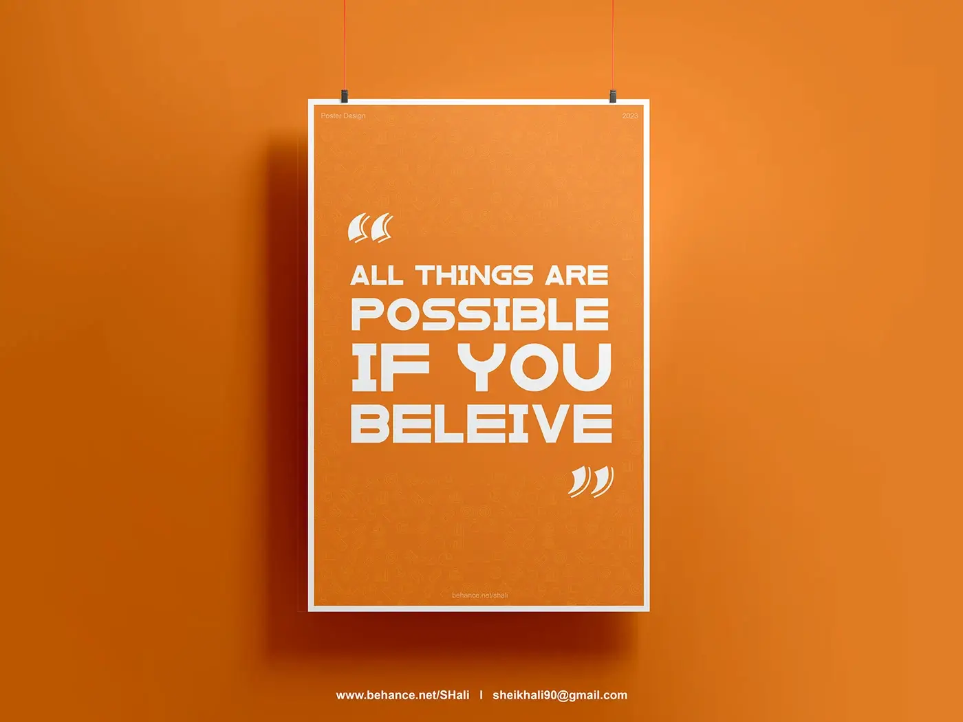
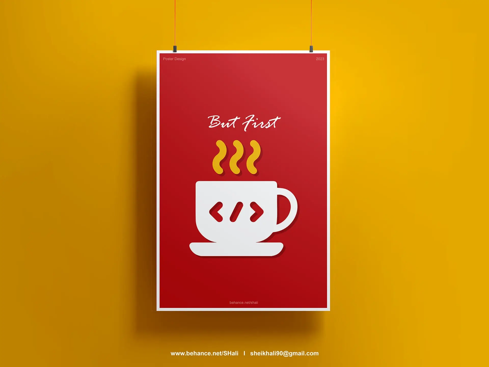
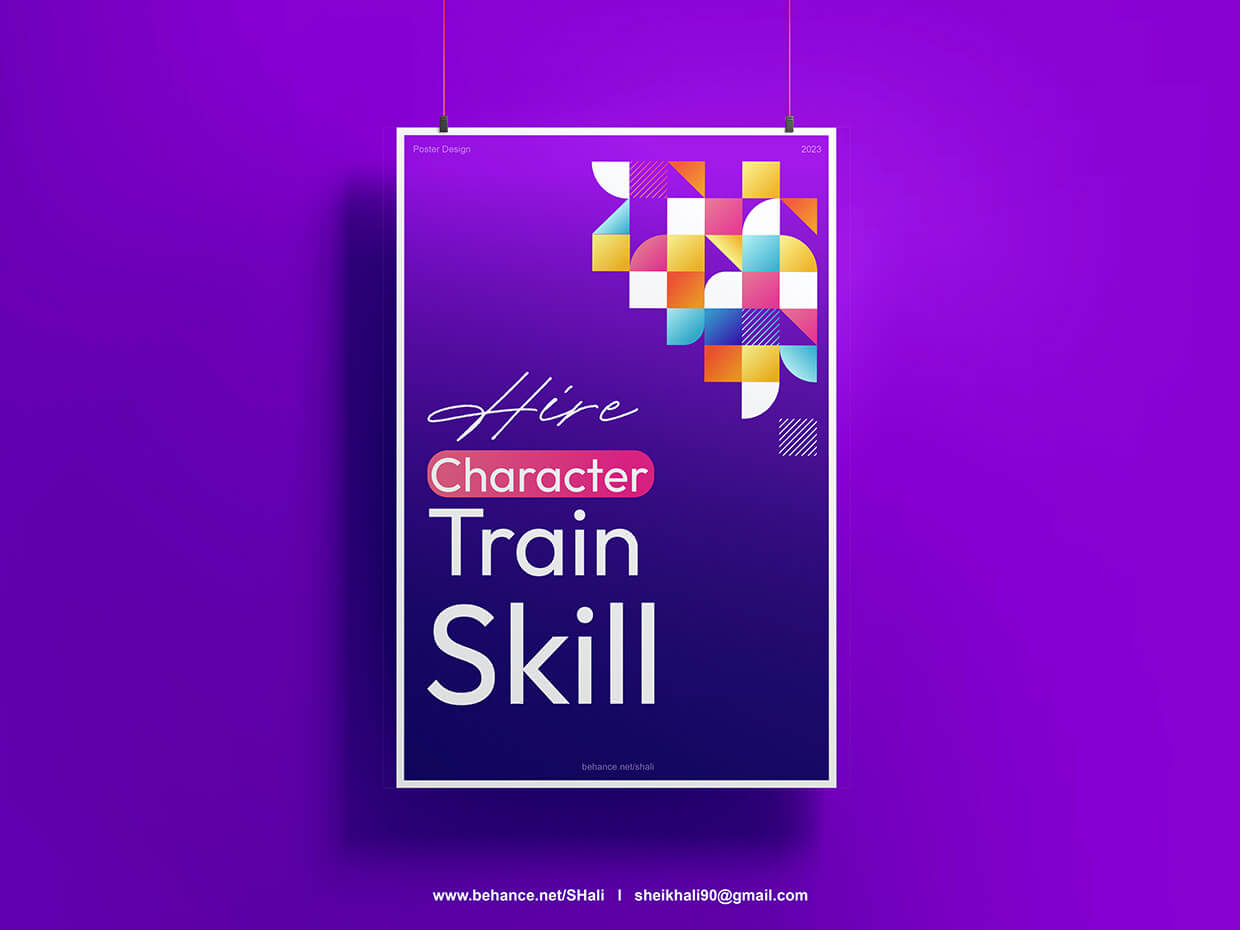
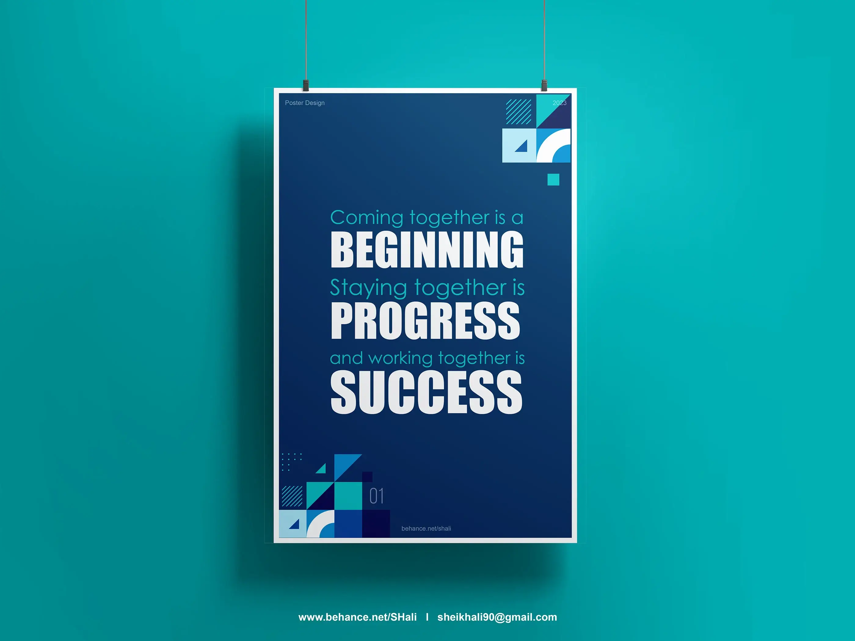
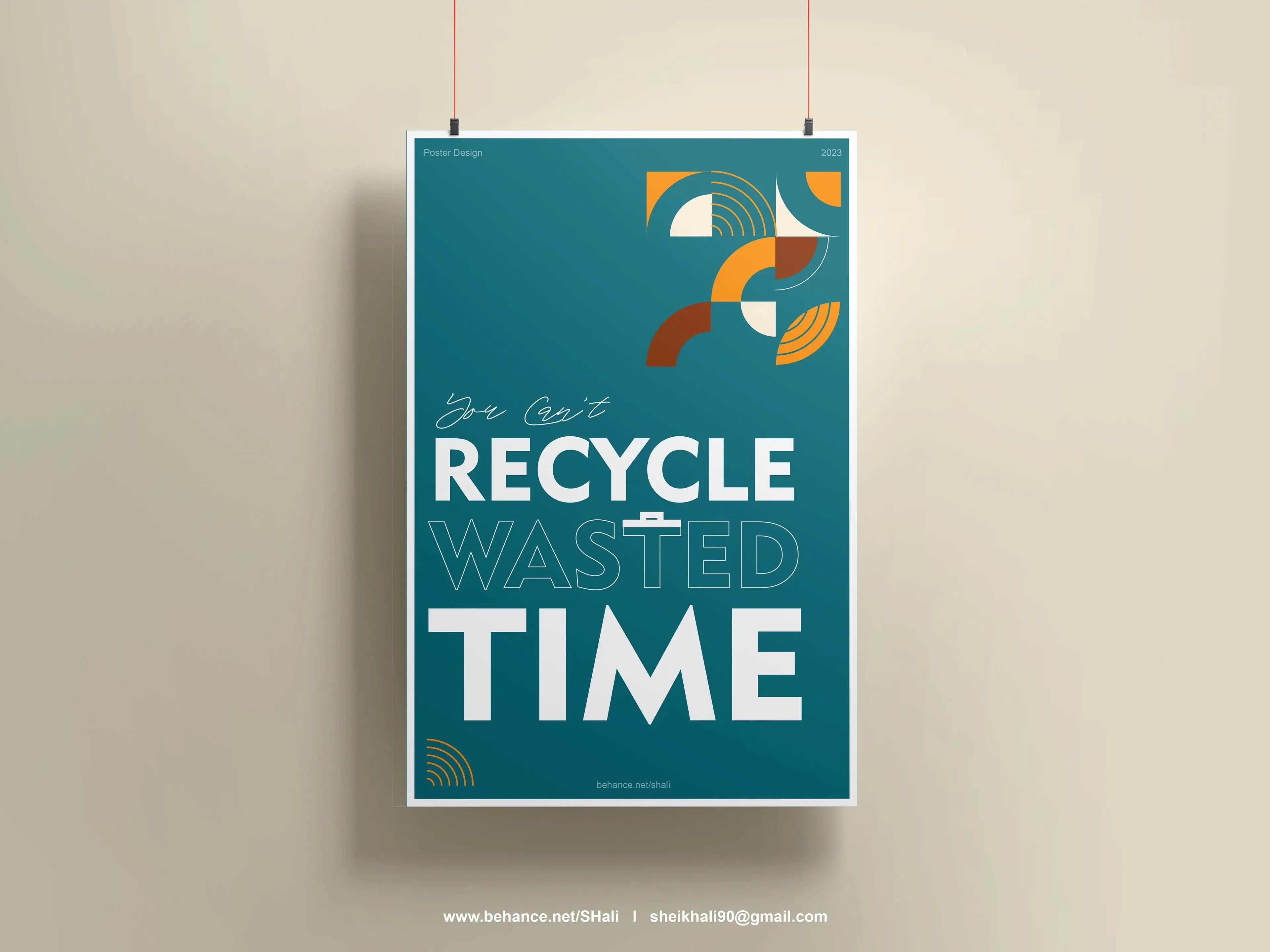
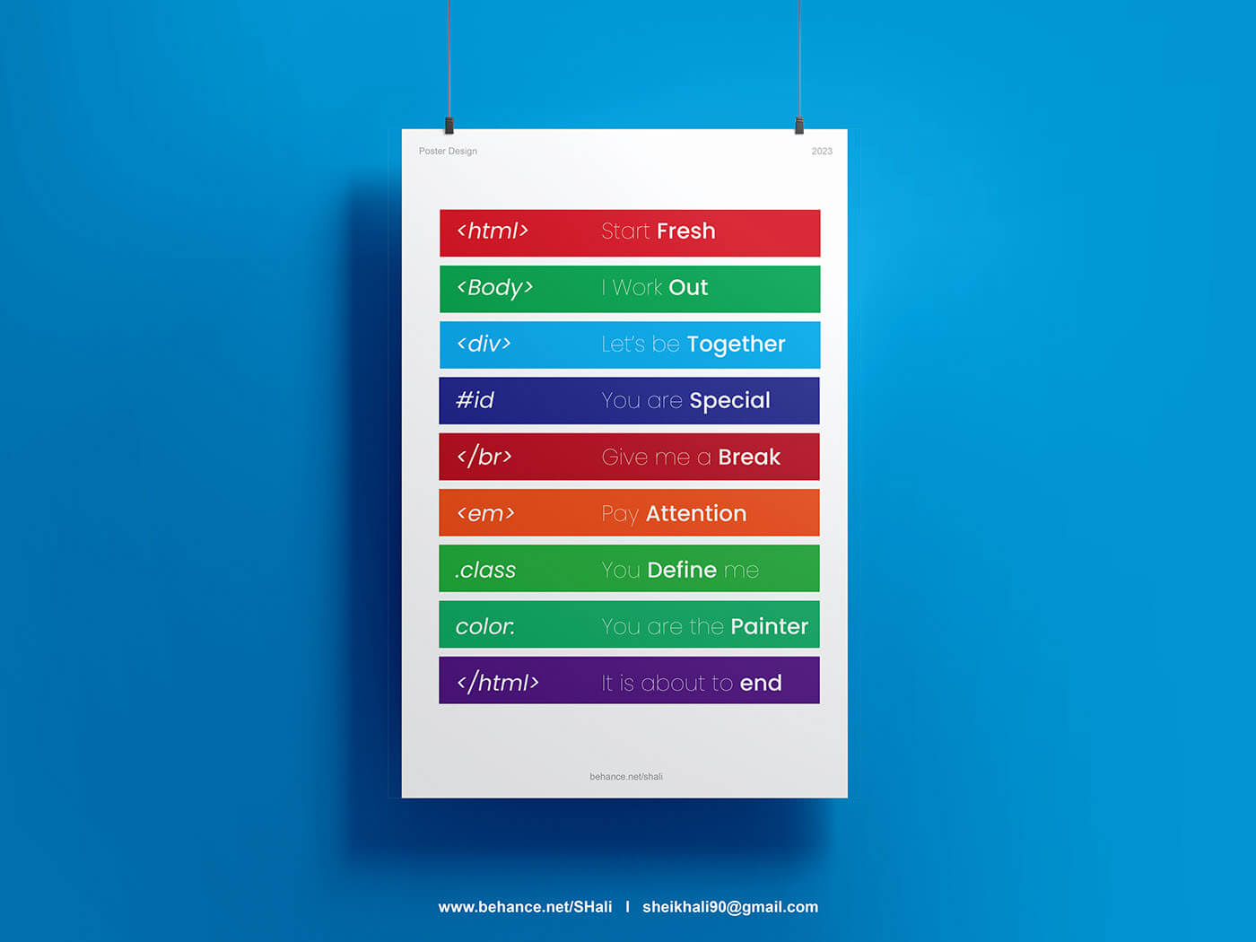
Product work rewards clarity and consistency. These posters are where I do the opposite: take one idea, push it to an extreme and see what the type can do on its own. Each poster is a small experiment with the same rule set, so the series reads as one body of work.
The project also sharpens my everyday UI skills. Hierarchy, contrast and rhythm are the same tools that make a dashboard readable, only here they are exaggerated.